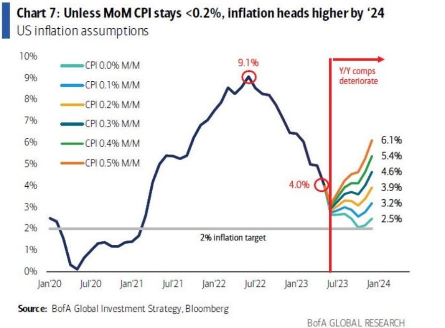
I have showed this chart before because it shows how the CPI chart laps some very easy comps soon.
What has emerged, pointed out by Omair Sharif, is that the numbers used on the chart are non-seasonally adjusted, which isn’t what is commonly (universally, frankly) used for the m/m CPI numbers.
What it showed was that even if CPI ran at 0.2% m/m until January, the year-over-year reading would rise to 3.9%.
This is problematic for two reasons:
1) If you use the standard seasonally-adjusted numbers, a 0.2% m/m reading would get CPI back to 2.5% in January.
2) If you insist on using non-seasonally-adjusted numbers, there’s a strong downward bias late in the year (because price hikes are usually done at the turn of the year).
Here is what the chart (by Preston Caldwell) shows if re-done for the standard seasonally-ajdusted numbers.
By that measure, a 0.2% m/m reading would be fine for getting CPI on track, especially considering that in March of 2024, the y/y comps begin to get easier.
The takeaway here is that we’re closer to 2% than it seems and it’s what the market is implying. That could change if the combo of housing, commodity prices and wages pickup but a 0.2% SA m/m reading is a fine baseline with what we know about the economy.