Today we learned that the US labor market remains as hot as it’s ever been and wage growth is strong. On its own, that would point to a strong consumer but markets aren’t acting that way. Higher interest rates, angst about the Ukraine war and recession talk are dominating the airwaves.
At times, that kind of talk can drown out the underlying story. Here are three charts that highlight just how healthy the consumer is.
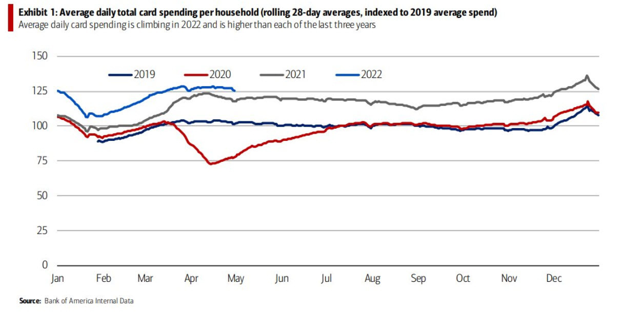
The first is Bank of America data on consumer spending, adjusted for inflation. It’s shifting from goods to services but still running well above 2019 and above 2021.
At the moment, all the headlines about falling goods spending is getting amplified by bears but Marriott hotels said was out this week saying demand was growing “like gangbusters”. What we see from JPMorgan credit card spending data is that people haven’t slowed down.
The final chart is on household financial obligations as a percent of disposable personal income. This data ends at the end of Q4 and I’ll be eager to see the Q1 and Q2 data as rates rise but we’re nowhere near the levels of the 1990s or 2000s and those were mostly heady times for growth and the consumer. These obligations include rent payments, auto lease payments, homeowners’ insurance, and property tax payments.
What I’m cognizant of is that some of these charts hide in the averages. People who haven’t gotten a wage hike and are seeing rent increases aren’t in a great spot to be spending.
